

































Color vision
Choose an available seat.
On touch, use Next focus to follow the route.
Try to finish the task. Show the fix when you’ve had enough.
Here’s what changed
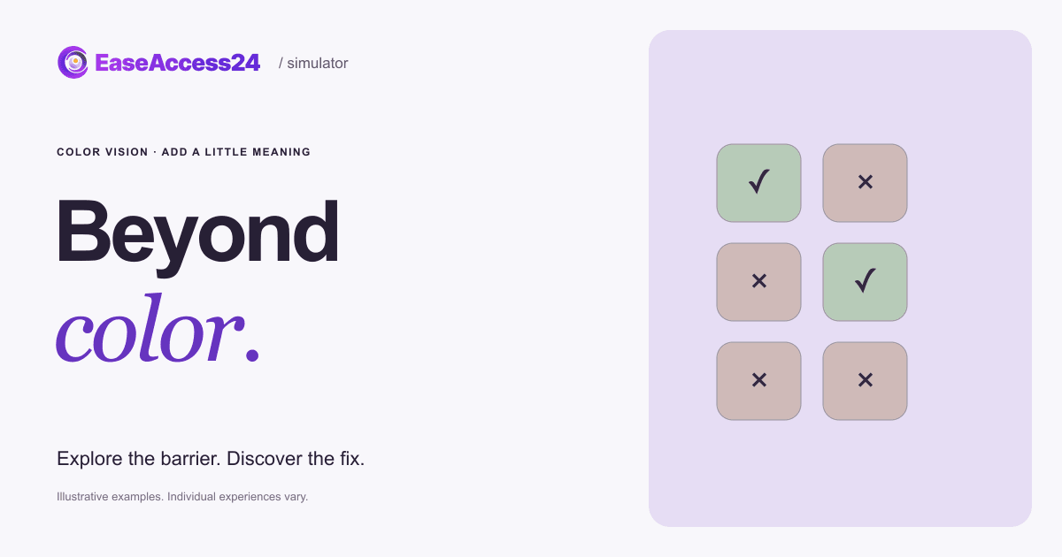
We added “Available” and “Sold out” labels, plus checkmarks and crosses. The color filter stays the same.
A customer who can’t tell red from green books a seat instead of giving up.Simulated view: red-green color blindness. The gold seats are what green (available) and red (sold out) can look like to someone with red-green color blindness (deuteranopia). It’s an approximation, and it stays on when you show the fix.
Now, your website
Is your website saying things in color alone?
Our audit identifies information conveyed by color alone. We provide code-level guidance for labels, symbols and accessible status messages, then re-test the implemented changes.
Read the text version
A2, B1 and B3 are available. The original shows status only in green or red. The fix adds written status and symbols under the same color approximation, so availability is no longer color-dependent.
How EaseAccess24 helps: Our audit identifies information conveyed by color alone. We provide code-level guidance for labels, symbols and accessible status messages, then re-test the implemented changes.
WCAG · Use of ColorHow to fix this on your website
Green seats are free and red seats are sold out. That is the only clue. Look through an illustrative color-vision filter and pick a seat you are sure about. A customer who can’t tell red from green books a seat instead of giving up.
- Pair every color cue with text, an icon or a pattern, such as a “Sold out” label.
- Show form errors with a written message and an icon, not only a red border.
- Underline links in body text, or give them another cue that isn’t color.
- Check charts, maps and status badges in grayscale and with a color-vision filter.
WCAG 2.2: 1.4.1 Use of Color (A) · 1.4.11 Non-text Contrast (AA). WCAG · Use of Color
Read more on the EaseAccess24 blog
Disability
Color Blindness in Europe: Statistics and Web Design Fixes
How common is color blindness in Europe, and how to stop relying on color

Guide
The Complete Guide to WCAG: Principles, Levels, and Accessibility Standards
A clear guide to WCAG principles, versions, and compliance for accessible web.
Development
How to Improve Your Website's Accessibility in 5 Easy Steps
Five practical steps developers can take today to improve website accessibility.
The example couldn’t load. Reload this example or read the complete text version above.