

































Blurry vision
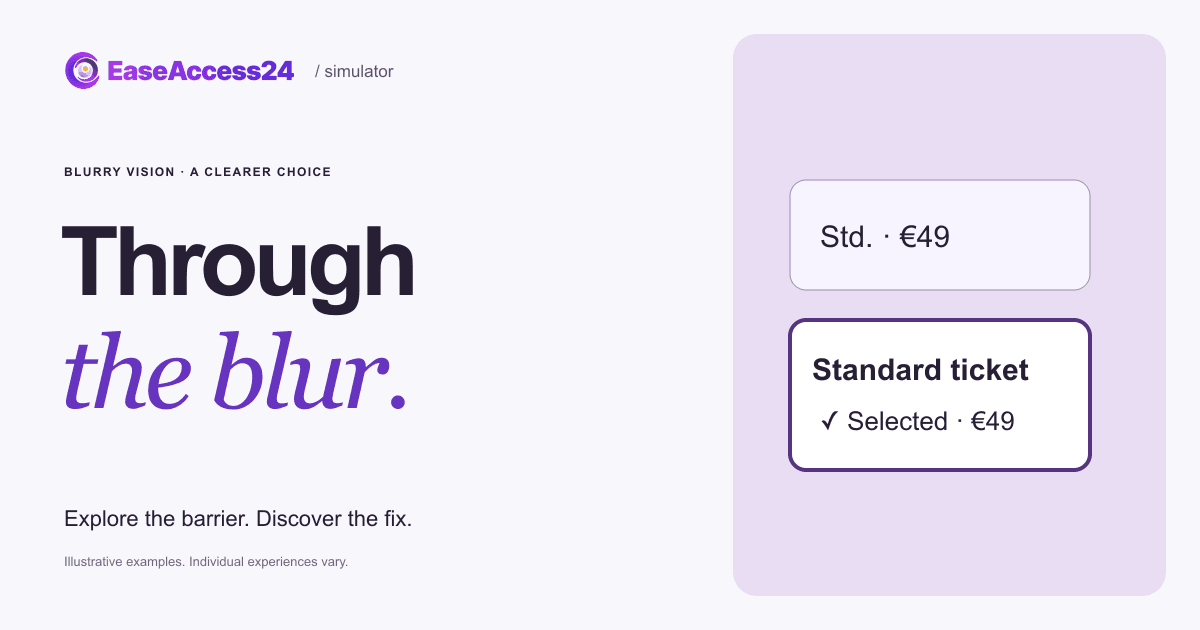
Choose a Standard ticket, then continue.
On touch, use Next focus to follow the route.
Try to finish the task. Show the fix when you’ve had enough.
The blur is an illustration. Individual experiences vary. It stays when you show the fix.
Here’s what changed
We enlarged the ticket cards, added clear labels, increased contrast and made the selected option obvious. The blur stays exactly the same.
The customer knows exactly which ticket they picked before they pay. The blur never changed.Now, your website
Can your customers tell which option they picked?
We review contrast, labels, control sizes and spacing in your booking flow. Our recommendations give your team concrete design and code changes, followed by checks of the repaired interaction.
Read the text version
Choose Standard (€49), then Continue. The original uses tiny ticket symbols, cramped options and faint text under a blur effect. The improved design keeps the same blur but adds large, clearly labelled ticket cards, strong contrast, generous spacing and an explicit Selected marker. Your choice carries over. This is an illustrative barrier, not a reproduction of any one person’s vision.
How EaseAccess24 helps: We review contrast, labels, control sizes and spacing in your booking flow. Our recommendations give your team concrete design and code changes, followed by checks of the repaired interaction.
WCAG · Target Size (Enhanced)How to fix this on your website
Through an illustrative blur, tiny symbols and faint labels turn a €49 choice into a guess. The customer knows exactly which ticket they picked before they pay. The blur never changed.
- Make tap targets at least 24 × 24 CSS pixels, and ideally 44 × 44.
- Label options and icons with visible text, not symbols alone.
- Show the selected option with more than a thin border or a color change.
- Use strong contrast for prices, labels and small print.
WCAG 2.2: 2.5.8 Target Size (Minimum) (AA) · 2.5.5 Target Size (Enhanced) (AAA) · 1.4.3 Contrast (Minimum) (AA). WCAG · Target Size (Enhanced)
Read more on the EaseAccess24 blog
Disability
Blurry Vision and Web Design: European Data and Fixes
Myopia, presbyopia and cataract in Europe, and how to design clearer controls

Guide
The Complete Guide to WCAG: Principles, Levels, and Accessibility Standards
A clear guide to WCAG principles, versions, and compliance for accessible web.
Development
How to Improve Your Website's Accessibility in 5 Easy Steps
Five practical steps developers can take today to improve website accessibility.
The example couldn’t load. Reload this example or read the complete text version above.